It is a long established fact that a reader will be distracted by the readable content of a page when looking at its layout. The point of using Lorem Ipsum is that it has a more-or-less normal distribution of letters, as opposed to using ‘Content here, content here’, making it look like readable English. Many desktop publishing packages and web page editors now use Lorem Ipsum as their default model text, and a search for ‘lorem ipsum’ will uncover many web sites still in their infancy. Various versions have evolved over the years, sometimes by accident, sometimes on purpose (injected humour and the like).
Category: Blog
-

Video in Slider
The blog post slider is automatically created with images you upload to the post and one video from Vimeo or YouTube (optional). This slider is a custom version of the ElastSlide third party plugin modified by our team to have a unique design.
When you enter the blog post, the slider is the first to show. Click on any thumbnail, and the slider will open. You have an up arrow to close the slider back to its original format.
If you don’t want to show the post slider, you can disable it for each post from Admin – Post settings.
To add a video to the slider simply Copy/Paste the video embedded code in Post Settings. The video will always show as the first thumbnail.
-

Images in Post
On the topic of alignment, it should be noted that users can choose from the options of None, Left, Right, and Center. In addition, they also get the options of Thumbnail, Medium, Large & Fullsize.

The image above happens to be centered.
 The rest of this paragraph is filler for the sake of seeing the text wrap around the 150×150 image, which is left aligned.
 As you can see the should be some space above, below, and to the right of the image. The text should not be creeping on the image. Creeping is just not right. Images need breathing room too. Let them speak like you words. Let them do their jobs without any hassle from the text. In about one more sentence here, we’ll see that the text moves from the right of the image down below the image in seamless transition. Again, letting the do it’s thang. Mission accomplished!
And now for a massively large image. It also has no alignment.

The image above, though 1200px wide, should not overflow the content area. It should remain contained with no visible disruption to the flow of content.

And now we’re going to shift things to the right align. Again, there should be plenty of room above, below, and to the left of the image. Just look at him there… Hey guy! Way to rock that right side. I don’t care what the left aligned image says, you look great. Don’t let anyone else tell you differently.
In just a bit here, you should see the text start to wrap below the right aligned image and settle in nicely. There should still be plenty of room and everything should be sitting pretty. Yeah… Just like that. It never felt so good to be right.
And just when you thought we were done, we’re going to do them all over again with captions!
Look at 580×300 getting some caption love. The image above happens to be centered. The caption also has a link in it, just to see if it does anything funky.
Itty-bitty caption. The rest of this paragraph is filler for the sake of seeing the text wrap around the 150×150 image, which is left aligned.
As you can see the should be some space above, below, and to the right of the image. The text should not be creeping on the image. Creeping is just not right. Images need breathing room too. Let them speak like you words. Let them do their jobs without any hassle from the text. In about one more sentence here, we’ll see that the text moves from the right of the image down below the image in seamless transition. Again, letting the do it’s thang. Mission accomplished!
And now for a massively large image. It also has no alignment.
Massive image comment for your eyeballs. The image above, though 1200px wide, should not overflow the content area. It should remain contained with no visible disruption to the flow of content.
Feels good to be right all the time. And now we’re going to shift things to the right align. Again, there should be plenty of room above, below, and to the left of the image. Just look at him there… Hey guy! Way to rock that right side. I don’t care what the left aligned image says, you look great. Don’t let anyone else tell you differently.
In just a bit here, you should see the text start to wrap below the right aligned image and settle in nicely. There should still be plenty of room and everything should be sitting pretty. Yeah… Just like that. It never felt so good to be right.
And that’s a wrap, yo! You survived the tumultuous waters of alignment. Image alignment achievement unlocked!
-
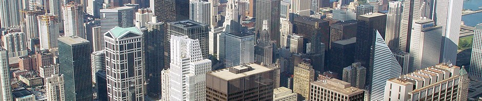
Why Live in New York
In contrast with New York City’s urban atmosphere, the vast majority of the state is dominated by farms, forests, rivers, mountains, and lakes. New York’s Adirondack Park is the largest state park in the United States. It is larger than the Yellowstone, Yosemite, Grand Canyon, Glacier and Olympic National Parks combined. New York established the first state park in the United States at Niagara Falls in 1885. Niagara Falls, on the Niagara River as it flows from Lake Erie to Lake Ontario, is a popular attraction.
The Hudson River begins at Lake Tear of the Clouds and flows south through the eastern part of the state without draining Lakes George or Champlain. Lake George empties at its north end into Lake Champlain, whose northern end extends into Canada, where it drains into the Richelieu and then the Saint Lawrence Rivers. Four of New York City’s five boroughs are on three islands at the mouth of the Hudson River: Manhattan Island; Staten Island; and Long Island, which contains Brooklyn and Queens on its western end.
Upstate and downstate are often used informally to distinguish New York City or its greater metropolitan area from the rest of New York State. The placement of a boundary between the two is a matter of great contention. Unofficial and loosely defined regions of Upstate New York include the Southern Tier, which often includes the counties along the border with Pennsylvania, and the North Country, which can mean anything from the strip along the Canadian border to everything north of the Mohawk River.
-

Full Width Post
The logo is a rebus borrowed by Milton Glaser from a Montreal radio campaign. CJAD Montreal Quebec Canada ran a campaign entitled “Montreal, the city with a heart”. The logo consists of the capital letter I, followed by a red heart symbol (♥), below which are the capital letters N and Y, set in a rounded slab serif typeface called American Typewriter.
Glaser expected the campaign to last only a couple months and did the work pro bono. The innovative pop-style icon became a major success and has continued to be sold for years. In the popular mind (though this was not the original intention) the logo has become closely associated with New York City, and the placement of the logo on plain white T-shirts readily sold in the city has widely circulated the appearance of the image, making it a commonly recognized symbol. Glaser’s original concept sketch and presentation boards were donated by Doyle to the permanent collection of the Museum of Modern Art, New York.
In 1977, William S. Doyle, Deputy Commissioner of the New York State Department of Commerce hired advertising agency Wells Rich Greene to develop a marketing campaign for New York State. Doyle also recruited Milton Glaser, a productive graphic designer to work on the campaign, and created the design based on Wells Rich Greene’s advertising campaign.
-
Selling Your Home
It is a long established fact that a reader will be distracted by the readable content of a page when looking at its layout. The point of using Lorem Ipsum is that it has a more-or-less normal distribution of letters, as opposed to using ‘Content here, content here’, making it look like readable English. Many desktop publishing packages and web page editors now use Lorem Ipsum as their default model text, and a search for ‘lorem ipsum’ will uncover many web sites still in their infancy. Various versions have evolved over the years, sometimes by accident, sometimes on purpose (injected humour and the like).
-

Manhattan Apartments
In Manhattan, uptown means north (more precisely north-northeast, which is the direction the island and its street grid system is oriented) and downtown means south (south-southwest). This usage differs from that of most American cities, where downtown refers to the central business district. Manhattan has two central business districts, the Financial District at the southern tip of the island, and Midtown Manhattan. The term uptown also refers to the northern part of Manhattan above 72nd Street and downtown to the southern portion below 14th Street, with Midtown covering the area in between, though definitions can be rather fluid depending on the situation.
Though the grid does start with 1st Street, just north of Houston Street (pronounced HOW-stin), the grid does not fully take hold until north of 14th Street, where nearly all east-west streets are numerically identified, which increase from south to north to 220th Street, the highest numbered street on the island. Streets in Midtown are usually one way with a few exceptions (14th, 34th and 42nd to name a few). The rule of thumb is odd numbered streets run west while evens run east.